

Table Of Content


1080 x 1920 pixels with a 9:16 aspect ratio is the correct Instagram Reel size. That is the required standard for the full-screen vertical video experience on Instagram.
Most Reel advice treats dimensions like housekeeping. In practice, dimension mistakes are distribution mistakes. When a Reel is framed wrong, text gets cut, product shots lose context, and CTAs land under interface elements. The result isn't just an ugly post. It's lower watch quality, weaker clicks, and a brand that looks less disciplined than it should.
Managing short-form systems across Instagram, TikTok, and YouTube has made one pattern obvious. Teams usually blame the hook, edit, or offer first. Often the failure happened earlier, in the canvas setup. A great Reel built on the wrong frame still underperforms because the viewer never sees the message the way you intended.
Instagram Reel dimensions matter because they define the viewing environment before creativity even starts. If your workflow begins with the wrong canvas, every later choice gets harder. If you want a practical build process, this guide on how to make an Instagram Reel is a useful companion.
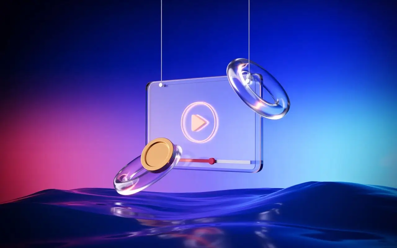
Your Guide to Flawless Instagram Reels
Instagram Reel dimensions are not a minor export setting. They are the base layer of performance. Instagram's full-screen Reel experience is built around a vertical canvas, and content that fits that environment cleanly looks native, intentional, and easier to consume.
The operational impact is easy to miss because the file still uploads. That's the trap. A Reel can publish successfully and still be misframed for the way people encounter it. In a growth workflow, that kind of silent failure is expensive because creative teams keep testing hooks while the format itself keeps sabotaging delivery.
What works in real workflows
The Reel format is built for a phone held upright. That means your shots, subtitles, speaker framing, product demos, and CTA placement all need to assume vertical attention from the first frame.
A few habits consistently work better than improvising at export time:
- Build vertical from the start: Don't shoot horizontal and hope a crop fixes it later.
- Frame the subject centrally: Off-edge compositions often look stylish in editing software and awkward inside Instagram.
- Design for overlays: Likes, captions, usernames, and controls all compete for space.
- Keep the CTA visually obvious: If the user has to hunt for the ask, the ask usually loses.
Practical rule: The Reel that looks best in your editor is not always the Reel that looks best inside Instagram.
What fails at scale
Teams run into the same problems again and again. Horizontal source footage creates cramped reframes. Large title cards touch the top or bottom edge. Product labels sit too low and disappear behind the interface. A polished brand ad suddenly looks amateur because the composition breaks in the feed preview.
That's why Instagram Reel dimensions should sit inside your creative brief, not just your export panel. Treat the frame as part of strategy, because it is.
Quick Reference The Official Instagram Reel Dimensions
If you only need the official baseline, use this: Instagram Reels are designed for a 9:16 vertical format, with a recommended upload size of 1080 x 1920 pixels. Instagram says Reels can be uploaded in aspect ratios from 1.91:1 to 9:16, but the full-screen experience is built around the vertical frame, and Instagram also specifies a minimum frame rate of 30 FPS in its help documentation (Instagram Reel upload specs).
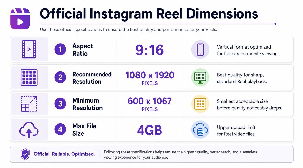
Official Instagram Reel dimensions at a glance
| Specification | Recommendation | Key Notes |
|---|---|---|
| Aspect ratio | 9:16 | Native full-screen vertical format for Reels |
| Recommended resolution | 1080 x 1920 pixels | Matches the standard vertical mobile viewport |
| Supported upload range | 1.91:1 to 9:16 | Wider formats can upload, but won't use the full-screen Reel experience as cleanly |
| Minimum frame rate | 30 FPS | Lower frame rates can look choppy in motion-heavy edits |
How to interpret the specs
The most useful way to think about Instagram Reel dimensions is this: Instagram allows flexibility, but rewards native formatting. Yes, other aspect ratios can upload. No, that doesn't mean they're equally good for performance or presentation.
If you're adapting existing assets, an aspect ratio calculator for social video can help you spot mismatch issues before export. That matters when you're repurposing clips from YouTube, webinars, podcasts, or widescreen ad creative.
A Reel can be technically accepted by Instagram and still be visually wrong for Instagram.
The teams that move fastest don't memorize every edge case. They standardize on 1080 x 1920 at 9:16 and build everything around that default unless there's a very specific reason not to.
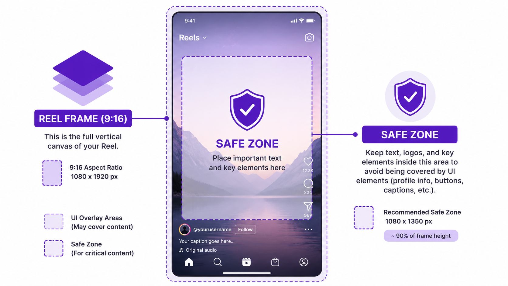
The Critical Importance of the Instagram Reels Safe Zone
The most expensive Instagram Reel dimensions mistake isn't using the wrong outer canvas. It's using the right canvas and placing the wrong content near the edges.
Independent sizing guidance recommends designing the Reel at 1080 x 1920 px in 9:16, while keeping critical text, faces, and CTAs inside a central safe zone because Instagram's interface and other placements can crop outer areas. One practical benchmark puts that usable safe zone at 1080 x 1420 px, and the same guidance notes that feed preview can behave like a 4:5 crop while the profile grid can crop to 1:1 (Instagram Reels safe zone reference).
Here's the visual version needed in a production process:
Why the safe zone matters more than people think
The safe zone protects your message from Instagram itself. Username bars, captions, action buttons, and placement crops all compete with your content. If your headline sits too high or your CTA sits too low, users may never fully read it.
Polished content often fails at this stage. The edit still feels strong in Premiere or CapCut. Then it goes live, and the CTA sits under UI chrome or the speaker's chin gets cropped in feed view.
A dedicated Instagram Reel cropper helps catch this before publishing, especially when your source footage wasn't created for vertical.
What to keep inside the safe zone
Keep the elements that carry the meaning of the Reel in the center:
- Primary headline: If it explains the hook, it belongs inside the safe zone.
- Face positioning: Eyes and mouth should stay comfortably centered, not floating near the top edge.
- Product proof: Packaging, app interfaces, and before-and-after visuals need room to survive feed and grid crops.
- CTA text: “Shop,” “Comment,” “DM,” or “Learn more” should never compete with interface overlays.
A short walkthrough can make this easier to visualize in practice:
The real trade-off
Creators often push text to the edges because it looks more cinematic or because they want to maximize space. That usually backfires on Instagram. A slightly tighter, center-safe composition almost always survives distribution better than an ambitious layout that depends on every pixel being visible.
Keep the message in the center. Decorative elements can live near the edges. Your offer can't.
If a Reel has one job, it's to make the first idea legible instantly. The safe zone protects that job.
How Instagram Crops Your Reel In Different Placements
A Reel doesn't live in one viewing mode. That's where many Instagram Reel dimensions guides fall short. Your video may look perfect full-screen and still look weak where people first discover it.
This comparison is the one creative teams should review before approving any publish:
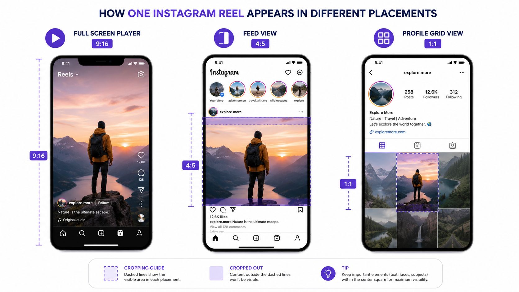
Full-screen player versus feed versus profile grid
These are the three placements that shape how your Reel is perceived:
| Placement | Display behavior | What to watch |
|---|---|---|
| Full-screen player | Shows the Reel in its native vertical experience | Best place for immersive storytelling |
| Feed view | Can behave like a 4:5 crop | Top and bottom tension increases fast |
| Profile grid | Can crop to 1:1 | Center composition becomes critical |
The practical issue isn't just cropping. It's sequencing. Many users first encounter the Reel in-feed or on your profile before they ever watch it full-screen. If the opening frame only works in 9:16, your discovery surface is weaker than you think.
What good center-safe composition looks like
Good center-safe composition gives you one strong frame that survives all placements. The subject is obvious in the middle. The opening text remains readable. The visual hook still makes sense when trimmed tighter.
If you also publish across platforms, comparing with TikTok video dimensions can help align your templates. The workflows are similar, but placement behavior still matters.
Design the first frame for the feed. Design the full story for the full-screen player.
What usually goes wrong
The most common failure is edge-dependent storytelling. Text starts too wide. A product sits low in frame. A side-by-side edit relies on both edges being visible. Then the feed crop removes context, and the Reel loses clarity before the viewer ever taps in.
Teams that understand Instagram Reel dimensions don't just optimize for one screen. They optimize for the whole path from discovery to watch.
Contrarian Take Stop Obsessing Over 4K Exports for Reels
Most creators are told to export everything in the highest quality possible. For Instagram Reels, that advice is usually more aspirational than useful.
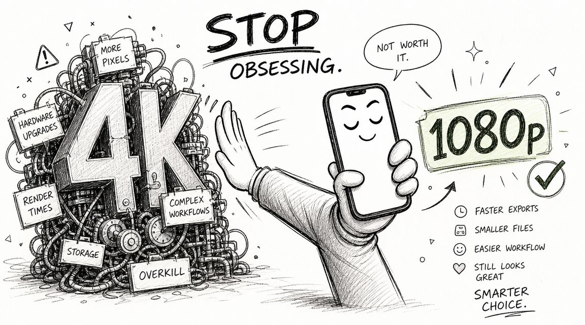
Why 4K is often the wrong priority
Instagram's native Reel canvas is 1080 x 1920. That means your final destination is already clear. If the platform is built around that output, chasing oversized exports can add workflow drag without creating a meaningful viewing advantage on a phone screen.
In real production environments, higher export sizes tend to create three problems:
- Heavier files: Editors take longer to render and upload.
- More friction: Team review cycles slow down because every revision costs more time.
- False confidence: Creators focus on file size and forget composition, pacing, and safe zone discipline.
What actually matters more than oversized exports
For Reels, clarity beats excess. Clean typography, stable framing, readable captions, and motion that holds up at mobile size matter more than bragging rights about export resolution.
The more practical target is simple:
- Native vertical canvas
- Crisp text
- Reliable motion
- Fast publish workflow
That's the combination that scales.
The operator mindset
Teams producing lots of short-form video need reliability more than theoretical peak quality. A fast, repeatable 1080 x 1920 workflow beats a bloated pipeline that creates delays, version confusion, and unnecessary upload risk.
Bigger files don't automatically produce better Reels. Better framing produces better Reels.
The contrarian view is straightforward. Don't optimize for editing vanity. Optimize for the screen Instagram gives you.
Optimal Export Settings for Reels (Premiere, CapCut, Zebracat)
Instagram Reel dimensions have stayed stable even as the format has matured. Reels launched in 2020, and the core production standard has converged around 1080 x 1920 pixels at 9:16. Current guidance also notes that Reels can be uploaded at lengths up to 3 minutes directly, with some third-party workflows reporting up to 15 minutes depending on the upload path (Instagram Reel size and length guidance).
Premiere Pro export preset
If you're exporting from Adobe Premiere Pro, keep the preset simple and repeatable:
- Frame size: 1080 x 1920
- Aspect ratio: 9:16
- Frame rate: 30 FPS or higher if your source needs it
- Sequence design: Keep text and faces center-safe
- Length planning: Build for Instagram's current Reel workflow, not an older short-duration assumption
The goal in Premiere isn't to chase every possible toggle. It's to create a preset your team can trust every time.
CapCut export preset
CapCut works well for fast-turn social teams because the vertical workflow is more obvious. The same logic applies:
- Start with a vertical canvas.
- Check text placement before export.
- Preview the first frame as if it were going into feed view.
- Export the Reel in the native Instagram frame.
CapCut's biggest strength for Reels is speed. Its biggest risk is that teams move so quickly they forget crop discipline and push captions too close to the edges.
When automation is useful
If you're producing Reels from prompts, scripts, or repurposed content, automation can reduce formatting errors. Zebracat is one option in this category. It can generate short-form videos and handle platform-specific dimensions, which is useful when non-editors need consistent 9:16 output without rebuilding settings manually.
If file size becomes a delivery issue, a video compressor for social uploads can help you reduce friction before posting.
The practical settings that matter most
A workable Reel export checklist is shorter than generally perceived:
| Setting | Recommended choice | Why it matters |
|---|---|---|
| Canvas | 1080 x 1920 | Matches Instagram's native Reel frame |
| Orientation | 9:16 vertical | Fills the screen cleanly |
| Motion | 30 FPS minimum | Preserves smooth playback expectations |
| Layout | Safe-zone aware | Protects CTA, captions, and faces |
| Duration | Respect current upload path | Avoids needless reformatting late in production |
The best export preset is the one your team can use without second-guessing every publish.
A reliable Reel workflow isn't complicated. It's disciplined.
Common Mistakes That Ruin Reels Before You Post
Most bad Reels aren't bad because the idea failed. They fail because preventable technical mistakes make the idea harder to consume.
Mistake one using the wrong frame
A horizontal clip dropped into a vertical container usually looks compromised. You either get awkward cropping, dead space, or a cramped subject. None of those outcomes feel native to Instagram.
The fix is simple. Start vertical whenever possible. If you must adapt horizontal footage, reframe manually and make sure the subject still reads at mobile size.
Mistake two placing key text near the edges
This is the classic “looked fine in the editor” problem. Titles, subtitles, offer text, and button-style CTAs often drift too high or too low.
Symptoms include:
- Covered captions: Interface elements compete with your text.
- Cut-off logos: Branding touches the edge and loses polish.
- Weak CTA visibility: The user doesn't clearly see what to do next.
Mistake three ignoring motion quality
Instagram specifies a minimum frame rate of 30 FPS in its Reel upload guidance, as noted earlier. If footage drops below that threshold or feels visibly choppy, the Reel looks cheaper than the brand behind it.
This matters most in demos, talking-head content, and fast text animation. Viewers may not name the problem, but they feel it immediately.
Mistake four designing only for full-screen playback
A Reel isn't judged only in the full-screen player. It's judged in the feed and on the profile grid too. If your first frame depends on edge detail or tiny text, the discovery surface weakens before the full watch even begins.
Mistake five making captions hard to read
Even with correct Instagram Reel dimensions, weak typography can sink comprehension. Tiny fonts, low contrast, and crowded subtitle stacks all slow the viewer down.
If people have to work to read your Reel, many of them won't.
The standard for good Reel design is not “technically uploaded.” It's “instantly understandable.”
Frequently Asked Questions About Instagram Reel Dimensions
Can I upload horizontal video as an Instagram Reel
Yes, Instagram allows uploads in aspect ratios from 1.91:1 to 9:16, but horizontal video won't deliver the same full-screen vertical experience as a native Reel. It usually looks less immersive and creates more layout problems than it solves.
What size should I design an Instagram Reel cover
A practical approach is to design the cover on the same 1080 x 1920 vertical canvas as the Reel itself, then keep the important visual centered so it still looks good when cropped in profile surfaces. The key is center-safe composition, not edge-heavy design.
Do Instagram Reel dimensions affect performance
Indirectly, yes. Dimensions shape how clearly the hook, subject, captions, and CTA appear in the app. Bad framing doesn't just look off. It makes the Reel harder to understand and easier to skip.
Should I export every Reel at 30 FPS
Instagram specifies a minimum of 30 FPS for Reel uploads in its help guidance referenced earlier. Generally, that's the right baseline because it balances smooth playback with a manageable workflow.
Are organic Reels and Reel ads sized differently
The smartest starting point is still the same native vertical canvas. If you already build around 1080 x 1920 with a center-safe layout, you'll avoid most of the formatting issues that make both organic and paid creative feel cramped or amateur.
If you want a faster way to turn ideas, scripts, blog posts, or product messages into correctly formatted short-form video, Zebracat is built for that workflow. It generates social videos in native vertical formats, helps non-editors produce usable Reel-ready assets, and reduces the formatting errors that usually happen when teams are juggling multiple tools.

Create videos 10x faster and easier with Zebracat
Try it now


Comments